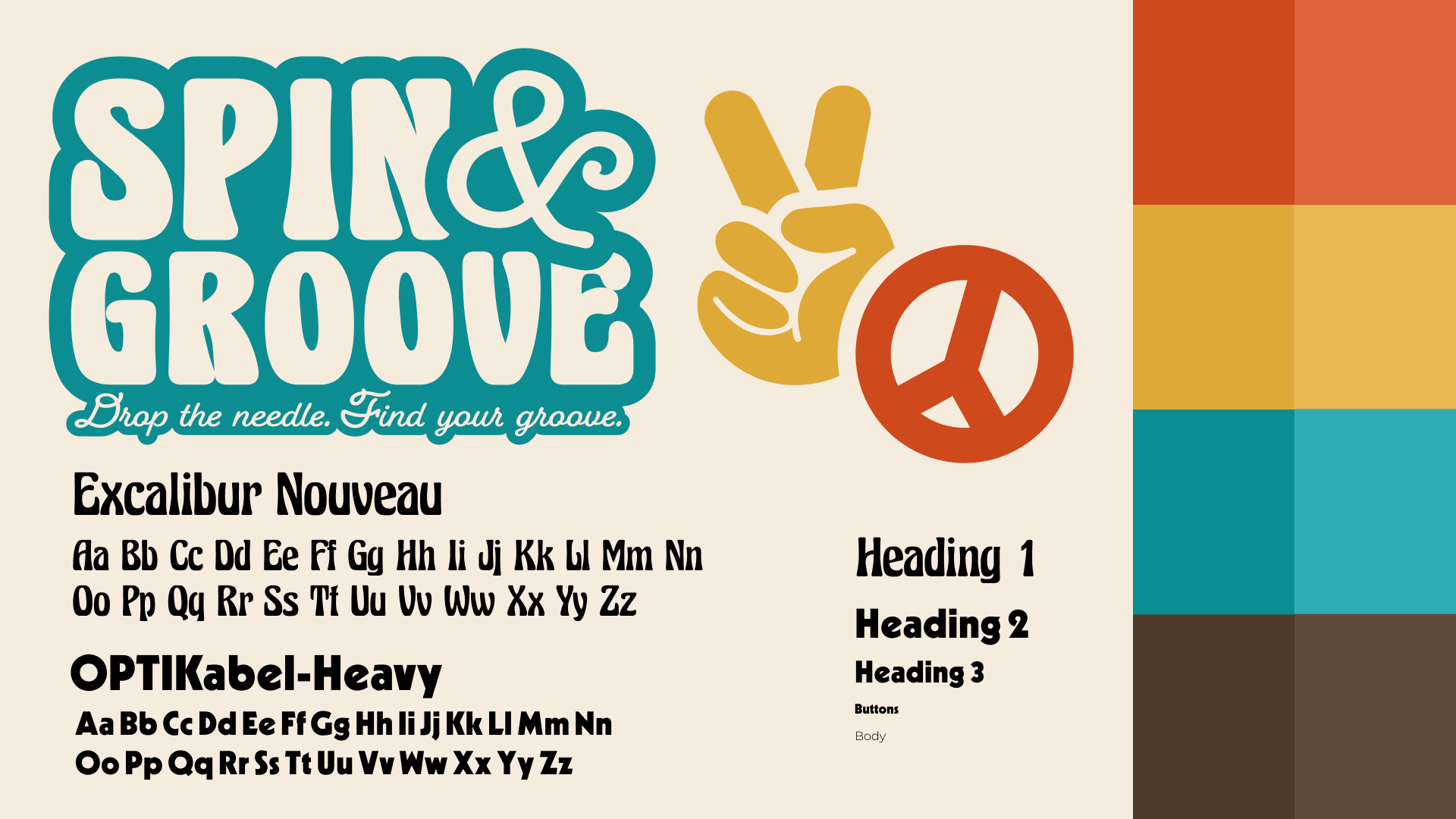

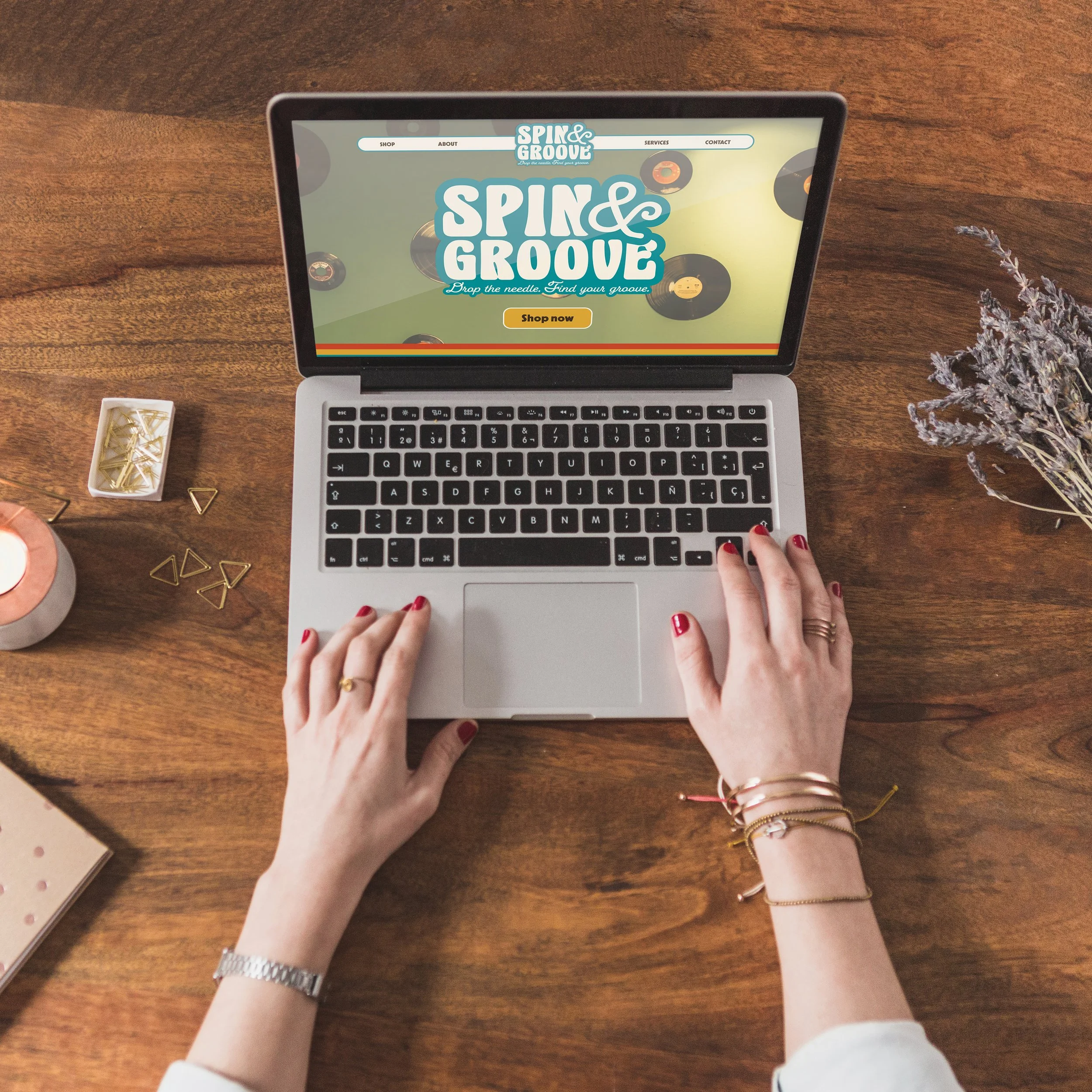
To practice my skills in responsive web design, I was tasked with creating a conceptual business and building both desktop and mobile website prototypes in Figma. My first step was to establish a brand. As a physical media lover, I chose a small store that sells vinyl, CDs, and other media. I wanted this store to reflect the aesthetics of the ‘70s and ‘80s, so I used bold colors and funky typefaces.
research
create business concept
built user persona and scenarios
wireframing
built wire frames for each page: index, category, detail, contact, about, and 404 error
Throughout the design process, I encountered the challenge of balancing visual engagement with user-friendliness. I found it most effective to first focus on gathering all the necessary information on my pages and later revisit them to incorporate more engaging elements. This approach allowed my site to achieve both practicality and strong visual interest, ultimately creating an experience rather than just a website.
process
design
copied over wireframes and inserted color, images, logos, and text
created functioning navigation with Figma’s prototyping feature
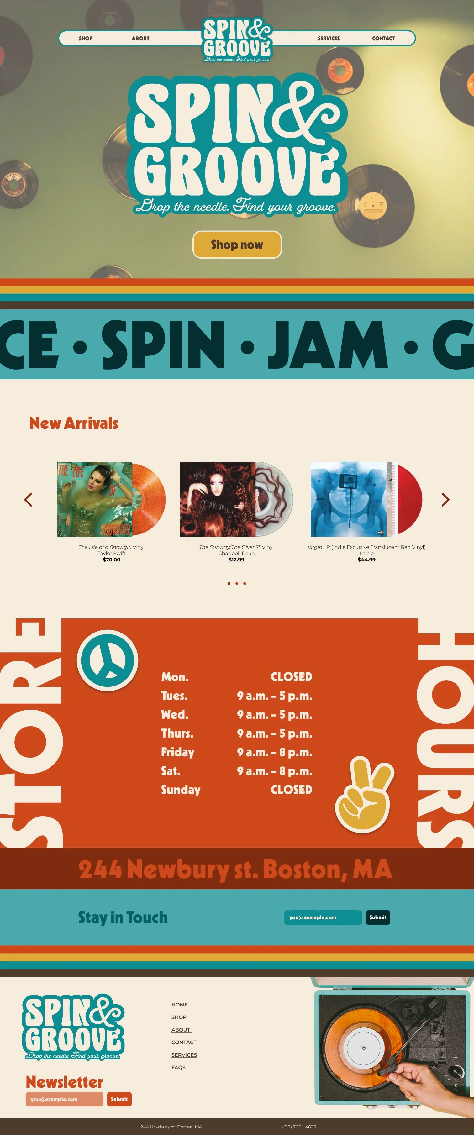
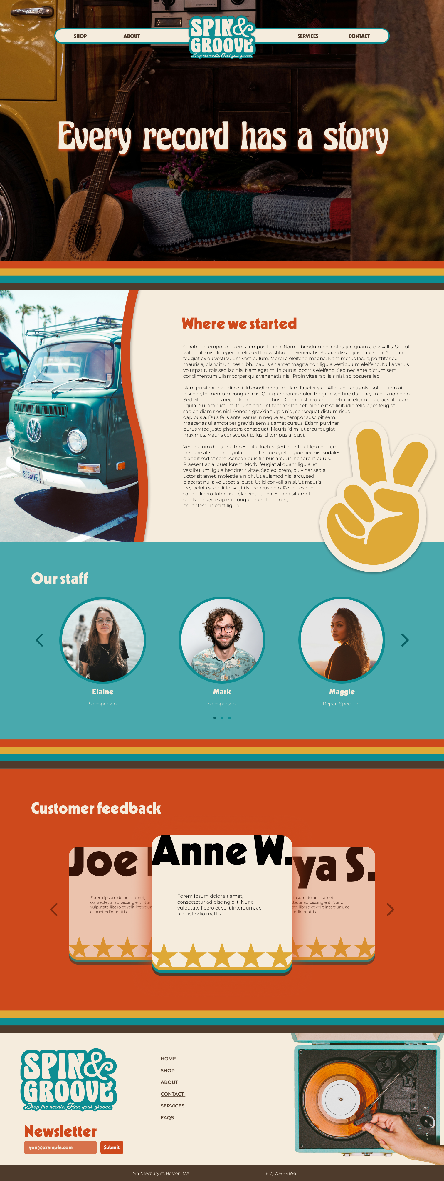
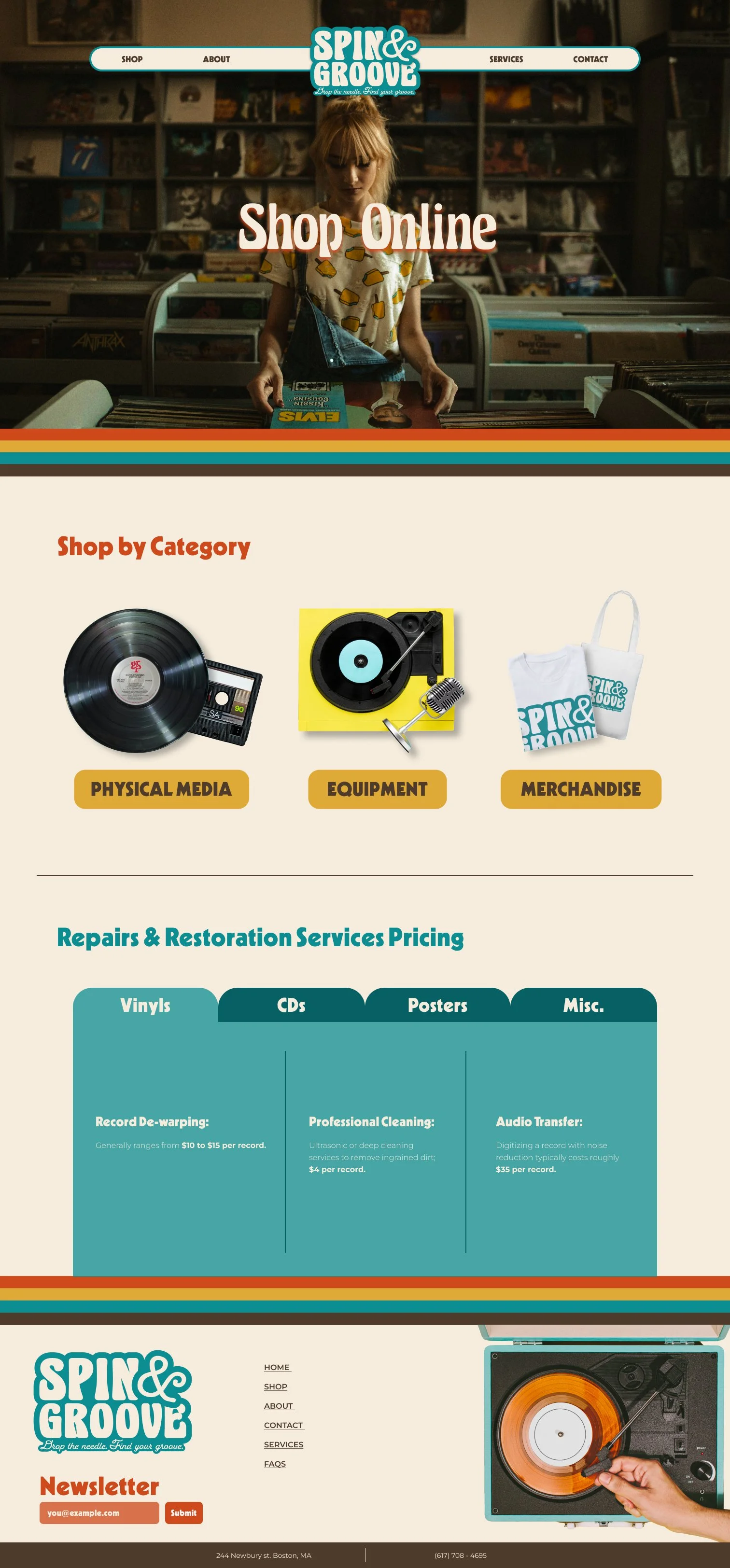
After establishing my groovy brand, I proceeded to design the website pages. I created index, about, category, detail, and 404 error pages for both mobile and desktop formats. Using a mobile-first mindset, I started with smaller screens and prioritized necessary information on each page before focusing on aesthetic elements.
feedback
website observed as an experience itself by viewers